Google recently unveiled their social network called Google+ and I’m fortunate to have access to the social network this early. With a simple search of ‘Google+ invites’ on Twitter, I was able to get my invite to Google+, thanks to @jrosenbaum. To know more about Google+, visit http://plus.google.com or watch any of the videos below to have a better idea of what’s instore. After watching the videos, do read my early impressions as well.
Setting up your account:
Setting up your Google+ account is really easy, specially if you have an existing Google Profile. After clicking the link on your invite, you’ll be asked to provide your gender and allow Google access to your profile. After completing this step, you’ll then be asked to start creating Circles.
Creating Circles:
By default these are the Circles available:
- Friends
- Family
- Acquaintances
- Following (Twitter, Google is after you too!)
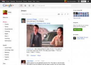
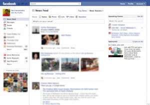
Setting up Circles is a breeze. Google will even ask you to start sorting your Gmail contacts in Circles. However, I suggest you opt out of this first, specially if your Gmail contacts are not in Google+ yet. After setting up your Circles, you’ll then be greeted by a pretty familiar User Interface (see images below).
Google+ is still in BETA and it’s unfair to give a final review based on existing functionalities. However, I can say that Google+ simply works. If you’re going to transition from Facebook to Google+, it will feel natural because of the familiar user interface. Based on my initial impressions, here are some of my Pros and Cons on the current BETA phase of Google+:
Pros:
- Google+ allows you to edit your status post if you made a mistake
- You can disable commenting or re-sharing of your status post
- The interface is clean as there are no ads (for now)
- The web app version of Google+ is pretty
- Google+ gives you details about Photos such as the camera used, the exposure, aperture, etc. This can be accessed by clicking a photo then clicking Actions > Photo details
- If you use Google services a lot, the sandbar on top allows you to readily access other Gmail services. If you’re in another Google service, it lets you know if you have notifications on your Google+ profile.
- Privacy. I hope it stays that way though.
Cons:
- It’s hard to access the chats which is located on the left side bar. It can get easily burried if you have a lot of Circles and Sparks.
- Accessing the web app via an Android device is pointless because it keeps asking you to download the Android App which is not available yet available in the Philippine Android Market.
- Although the sandbar is a nice touch, with the addition of Google+, it feels more apparent that Google is following your every move. As much as privacy is a concern on Facebook, it feels the same here.
- The Circles UI gets cluttered when you have lots of circles and lots of friends. It would be better if the UI is in vertical columns instead of horizontal rows.
- Signing up for Google+ automatically signs you up for Picasa Web Albums. All photos and videos you upload on Google+, including from your phone via Instant Upload) will also be available in Picasa Web Albums. I don’t want another service replicating my photos.
I think Google is headed in the right direction with Google+ and it’s absolutely way better than Google Wave or Google Buzz. The biggest question on everyone’s mind though is: ‘Will it turn Facebook into the next Friendster?’. Not yet but only time will tell.


